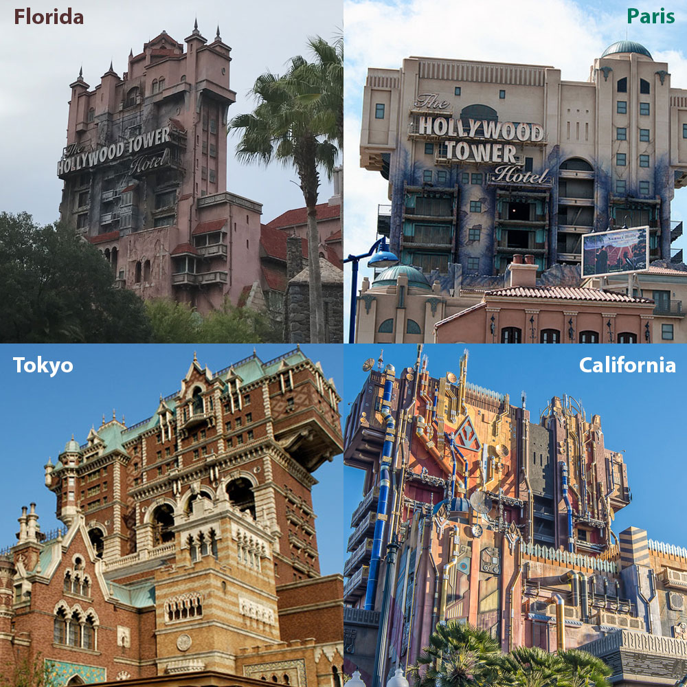
The fundamentals of the ride are the same across all four Towers, but the architecture on the outside varies:
- Florida: pink-colored Neo-Mediterranean styling
- Paris: boxy yellow-and-teal Pueblo Deco styling
- Tokyo: ornate Moorish Revival (ie: New York brownstone)
- California: Guardians of the Galaxy stuff

So why the architectural differences?
Disney doesn’t really drop an attraction into a park without thought to how it will complement the surrounding area. Each park section has its own look and feel, and everything in that section (even down to the trash cans and street lamps) is designed to fit in.
So while a Neo-Mediterranean tower fit in the “old Hollywood” of MGM-Studios, Florida, Disney’s Imagineers felt that a Pueblo Deco building was more appropriate for the heavily California themed Disney California Adventure park, even though both are creating an idealized vision of Hollywood.
Like most art, architecture doesn’t exist in a vacuum. A single structure may incorporate traits from multiple time periods and regions. As we explore the architecture styles of the Tower of Terror attractions, keep in mind that many design ideas are so widely used that they can be represented in multiple architectural styles.
The Original Original Tower
Before we dig into the individual Towers, let’s first meet the original Hollywood Tower.

No, it doesn’t look much like the rides – all it really has in common is the glowing Hollywood Tower sign and the pointy towers atop the roof. But it’s been cited by Imagineers as inspiration for the attraction, so there you go.
The Hollywood Tower (how difficult it is to type that without adding “of Terror”!) is an apartment complex designed by Cramer & Wise and built in 1929 in the heart of Hollywood. It still stands today. It’s considered a Hollywood landmark and national treasure (it was even added to the National Register of Historic Places in 1988).
Nineteenth and twentieth century revival styles were all the rage in early Hollywood, so the Hollywood Tower is far from the only “faux historic” building in the area, and we’ll get to the importance of those other buildings in the Florida Tower of Terror’s section.
Now that you’ve met the granddaddy, let’s meet the offspring.
The First Tower of Terror
The original Tower of Terror’s most noticeable architectural characteristics are Neo-Mediterranean, a revival style that peaked in popularity in the 1920’s and 1930’s in both California and Florida. The style was especially popular for hotels and apartment buildings. Characteristics of Neo-Mediterranean include red tiled roof, arched doorways and windows, keystones, stuccoed walls, rectangular floor plans, and even lush gardens.
But the Tower of Terror also draws inspiration from at least two real life Hollywood hotels. The Tower’s twisted columns, minarets, archway ornamentations, and gardens are reminiscent of those of the Mission Inn Hotel and Spa in Riverside, California.

The Château Marmont Hotel of Hollywood, California looks at first glance like the tower repainted. Its blocky facade and roof gables are echoed in the Tower’s design.
Some elements of Spanish Gothic architecture tie it all together: the tiled roof, pinkish-orange facade, and soaring height are all reminiscent of the style.
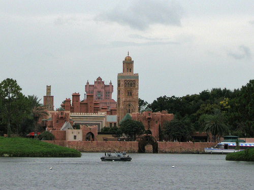
Oh, and it had to blend in with EPCOT’s Morocco exhibit.
The California and Paris Tower of Terrors

After Disney California Adventure opened in 2001 to relatively poor reviews, Disney’s Imagineers set to work on improving the park. Opening in 2004, the new DCA Tower of Terror was one of the first imports brought in to help perk up the park.
But since Disney California Adventure is a celebration of California, the Tower would need an architectural makeover to really fit in at its new home on the park’s Lake Buena Vista street, which recreates Los Angeles as it appeared when Walt Disney lived there in the 1920s. So whereas the original Tower was inspired by old Hollywood, the DCA Tower would be inspired by… 1920’s LA. It’s a subtle difference, I agree. 🙂
The California (and later, Paris) Tower was built in the distinctly American Pueblo Deco architectural style. Pueblo Deco is a hybrid of Art Deco, which characterized by geometric shapes and bright colors, and Pueblo Revival, characterized by southwestern Native American motifs like sunbursts and arrowheads, adobe (real or simulated) exteriors, and flat roofs.


Combinations of the two can be found throughout the American Southwest. The DCA/Paris Tower of Terror’s fake construction plaque gives it a construction date of 1929, placing it right in the midst of the Art Deco fever that swept the United States between the World Wars.
But wait, why is the Paris tower built to look like California if it’s in Paris? When the Tower came once again to the rescue of lagging ticket sales, this time in Paris, there was no “Hollywood Street” already established in the park. So Disney made one.
The decision to keep the Tower grounded in Hollywood was probably both a cost-saving move (yay, recycling!) as well as a desire to celebrate Disney’s California and Hollywood roots.

The DCA and the Paris Towers were practically twins, but if you looked real close near the top you’d see the easiest to spot difference:
The Lobbies
If there’s one thing the Hollywood Studios Tower and the DCA Tower share, it’s their lobbies. Identical in layout but varying architectural details (most notably the ceiling structure), both lobbies were inspired by the real-life Biltmore Hotel.
Biltmore Hotel ceiling:

Tower of Terror (Hollywood Studios) ceiling:

Biltmore elevator doors look a lot like the Tower of Terror’s pre-library wait area:
The Tokyo Tower of Terror

Tokyo Disneysea’s Tower of Terror is mechanically identical to DCA/Paris, but the rest is a complete reimagining of the story concept and architectural design. The new Tower was plopped down in the established “American Waterfront” land, set in turn-of-the-century New York Harbor and Cape Cod. A story about the New York City Preservation Society’s efforts to save the historical hotel and solve the mystery of its owner’s disappearance was built up around the new Tower. Since the attraction was “relocated” to New York, styling it after old Hollywood or the American Southwest would be out of place.
Imagineers undoubtedly looked first at turn-of-the-century New York for inspiration, where the Moorish Revival architectural style was enjoying a period of popularity. Below, an example of Moorish Revival architecture (also known as Mudéjar, and not to be confused with Moorish).

The DisneySea Tower’s multifoil arches, small domes, simple window tracery, and detailed brickwork are all characteristic of the Moorish Revival style. The style also emphasizes articulation – the emphasizing of distinct parts of the building.
Compare with the DisneySea Tower:

A few other influences are mixed in, such as elements of New York’s famous Brownstones. The brickwork designs, roof gables, lighter stone window trims are all traits of Jacobethan architecture, and the columns and layered arches hint at some Neo-Byzantine and Richardsonian-Romanesque influences.
In contrast with the other two Tower designs is the noticeable lack of lightning damage on the DisneySea Tower’s facade. According to the story, the destruction came from within on this version. The stained glass windows are broken, but the building itself looks pristine.
As long as we’re on the topic of New York…
Some say the Palazzo Chupi looks quite a bit like the Tower of Terror. We’ve apparently gone full circle. 🙂


