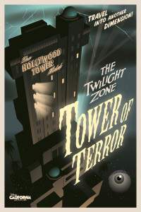
The Twilight Zone Tower of Terror in Disney California Adventure opened its gates to the public on May 5th, 2004. This Tower opened 10 years after the original, located in Florida, and includes many design changes. Mostly, they slimmed it down. Disney’s Imagineers reworked the Tower’s design to compact it and reduce the frequency of mechanical breakdowns.
The ride offers three drop shafts and guests move more briskly through the attraction. The DCA Tower has two mechanically identical siblings in Tokyo and Paris.

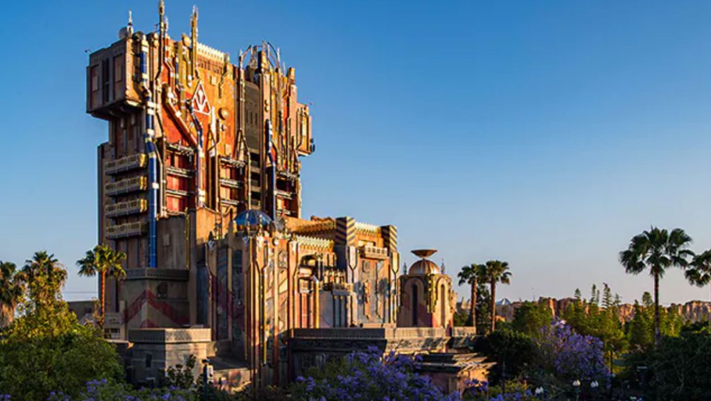
This Tower was re-themed to “Guardians of the Galaxy: Mission Breakout” in 2017. This page documents its original design.
The DCA Tower’s Early Development
The first Tower of Terror (in Hollywood Studios, Florida) proved so popular that when Disney started looking for ways to punch up their newly-opened and poorly-reviewed Disney California Adventure, building another one must have seemed obvious.
Disney rarely builds the same attraction twice. Usually they make improvements (which are sometimes controversial) and oftentimes they aim to reduce the cost of building the attraction.
Sometimes they have to adapt the design to the park’s unique geography or layout. For example, Disney’s basically out of space in California. The recent Cars Land expansion to DCA chewed up what was formerly a parking lot. So it makes sense that the new Tower needed a smaller footprint, hence the minimalist garden and single drop shaft.
Disney’s done this before – the Haunted Mansion is a classic example. In Disneyland, California, the Haunted Mansion’s architecture fits the antebellum New Orleans area and the “stretch room” is actually a large elevator lowering passengers down to the attraction’s track, which runs underneath the Disneyland Railroad train tracks. Over at the Magic Kingdom in Florida, the Mansion’s Dutch Gothic Revival architecture fits the Colonial era inspired Liberty Square and the ceiling rises instead of the floor lowering.
DCA Tower Construction
The new Tower’s Pueblo Deco architectural style was likely chosen to fit the new Tower into its new California home. The DCA Tower even got its own fake construction date: 1929.
Changes From the Florida version
Redesigns to beloved Disney attractions are almost always controversial among fans. The Tower is no exception. Almost as soon as the scaffolding went up, fans started squawking about the DCA’s Tower’s reduced budget, smaller footprint, stouter appearance, and Pueblo Deco architecture. But the designers were trying to be smart – they knew the ride would be popular, and the sacrifices they made served to enhance efficiency and reduce downtime.

The ride experience still climaxes in a series of thrilling drops and a startling view of the park, but everything before and after the drops was compacted. In the DCA Tower, all the action takes place in just one elevator shaft. The 5th Dimension scene from the Florida version was removed completely. In its place is a fantastic visual effect of a mirror reflecting the riders. The riders fade from the car in a ghostly, ethereal effect that can be actively smeared around the canvas by waving your arms around.
A third drop shaft was added (a 50% increase in capacity right there!) and the boiler room (loading area) was given two vertically stacked loading decks. These design changes greatly reduced the frequency of breakdowns and substantially increased the Tower’s rider throughput, but some fans were unhappy with the compromises on theme and appearance.

The DCA Tower Today
I got busy raising a family and haven’t visited the California parks since the new theme was applied. I’ll reserve my judgment until I actually have a chance to see the update in person – I’m sure it’s still a fun ride.
It looks like this now:


